From Manuscript to Ebook: the five decisions that matter
Before any design happens, five decisions decide whether your ebook reads well. A plain checklist for authors and organisations.

An ebook fails or succeeds long before the cover is drawn. These are the five decisions we make with every author in the first conversation — in this order, because each one constrains the next.
- Who reads it, and on what? A phone commuter and a print-loving board member need different type sizes. Decide the primary reader; the rest follows.
- What is the spine? One sentence that says what the book promises. Every chapter must serve it or leave.
- How long is a thought? Chapter length sets the rhythm. Short chapters read faster and forgive denser prose.
- What repeats? Headings, pull quotes, figure captions: name them now so the layout can be a system, not a series of accidents.
- What does “finished” mean? Print PDF, web PDF, editable source? Agree the deliverables in writing before page one is set.
The mistake we see most
Authors design the cover first. It feels like progress and it is the least constrained decision you will make. By the time the interior exists, the cover rarely matches it — and then someone pays twice.
What you should have at the end
A print-ready PDF that passes a printer’s preflight, a lighter web PDF that opens on a phone without pinching, and — if you asked for them — the source files so next year’s edition is an edit, not a rebuild.
Our ebook design service covers all five decisions in the quote, so you know the price of the whole journey before you take the first step.
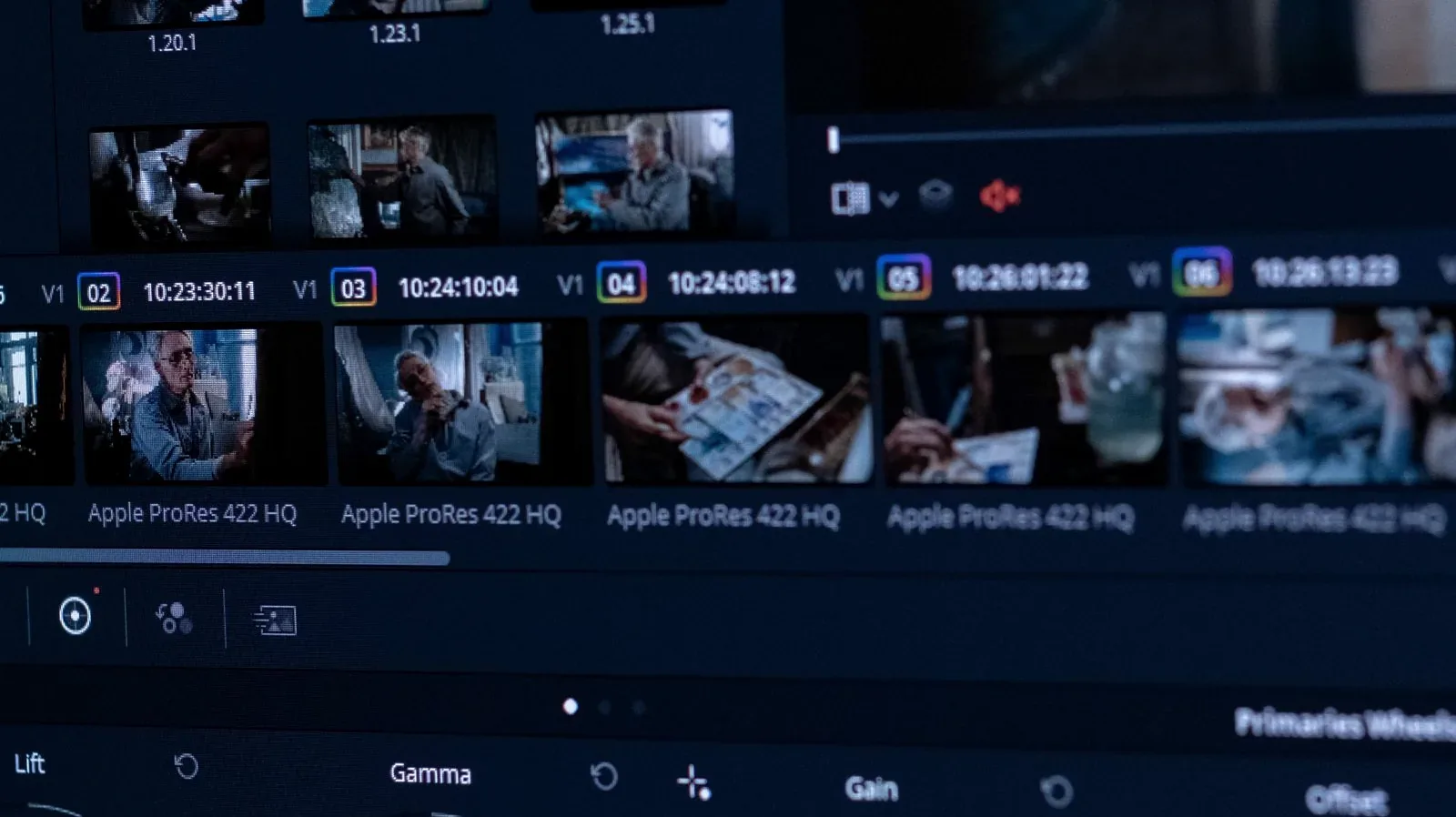
Colour Grade in Five Steps (without making it weird)
A calm, repeatable grading order: balance, exposure, contrast, skin, then look. Works in Resolve, Premiere or anything…

A Logo That Works at 16 Pixels: the four tests we run
Favicon, stamp, embroidery, mono fax: the four brutal tests that separate a logo from a drawing. Includes a size ladder…