A Logo That Works at 16 Pixels: the four tests we run
Favicon, stamp, embroidery, mono fax: the four brutal tests that separate a logo from a drawing. Includes a size ladder you can copy.

Every logo looks confident at 800 pixels. The job is to keep it confident at sixteen. These are the four tests we run on every mark before a client sees it.
Test 1 · The favicon test
Shrink it to 16 and 32 pixels. If the idea survives, you have a mark. If only a smudge survives, you have an illustration pretending to be a mark.
16 px
32 px
64 px
128 px
Test 2 · One colour, rough surface
Stamp it, embroider it, fax it. A mark that needs its gradient to be recognised will fail on a cardboard box, and cardboard boxes are where brands live.
Test 3 · The wrong background
Dark photo, busy pattern, someone else’s brand colour next to it. The mark needs a version for each: solid, reversed, and outlined.
Test 4 · Said aloud
If a customer cannot describe it over the phone (“the one with the two squares”), your team will redraw it differently every time. Simple shapes survive telephone.
When a mark passes all four, we hand over SVG, PNG and PDF masters plus a one-page guideline — so the thousandth use looks like the first.
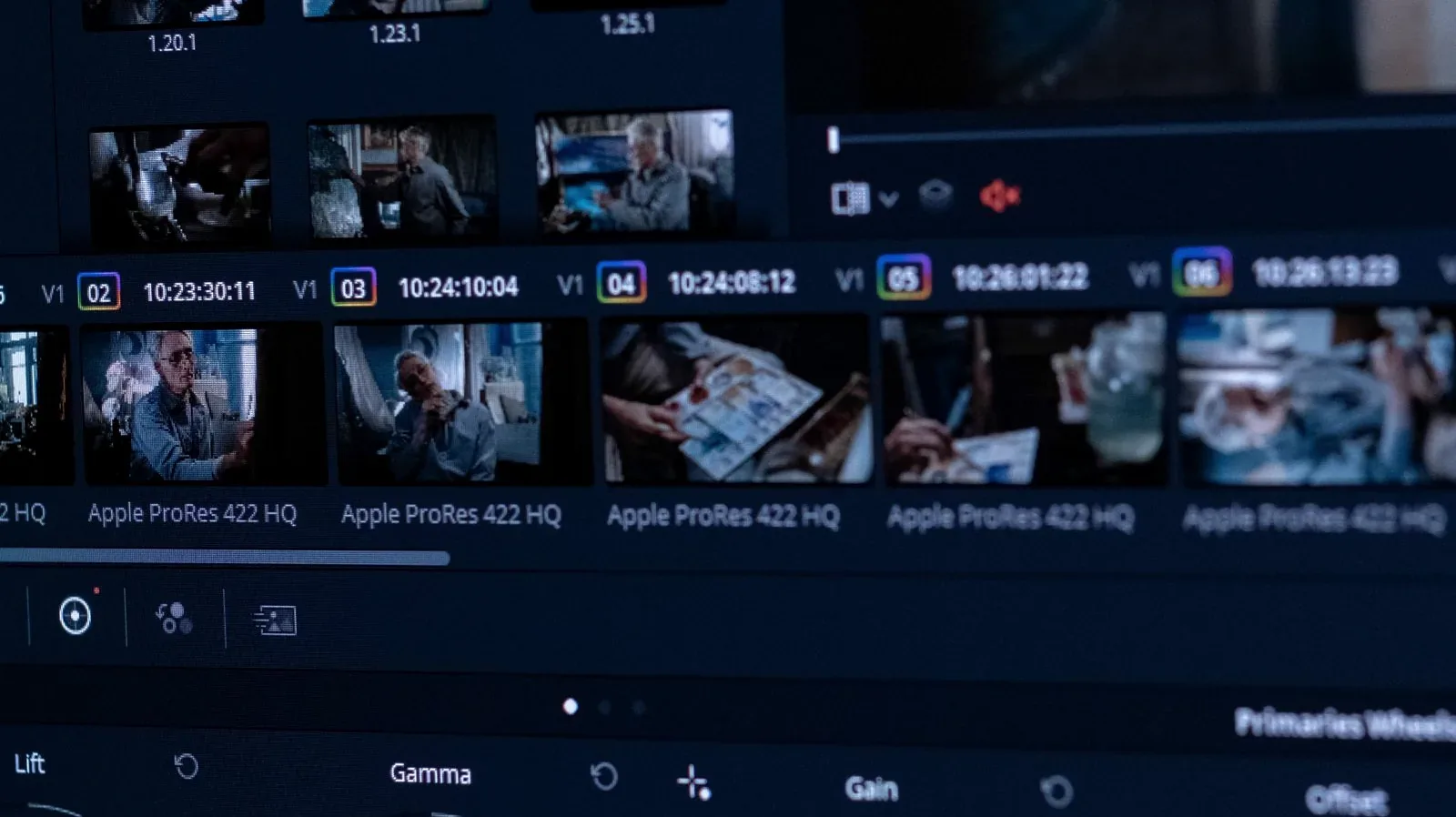
Colour Grade in Five Steps (without making it weird)
A calm, repeatable grading order: balance, exposure, contrast, skin, then look. Works in Resolve, Premiere or anything…

From Manuscript to Ebook: the five decisions that matter
Before any design happens, five decisions decide whether your ebook reads well. A plain checklist for authors and organ…